pacman::p_load(ggdist, ggridges, tidyverse,
ggthemes,colorspace)Hands-on Exercise 4: Fundamentals Statistics of Visual Analytics
1. Roadmap for Studying
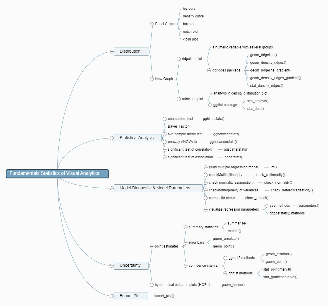
2. Visualize Distribution
2.1 Getting Started
2.1.1 Install and Load R packages
tidyverse for data science process
ggridges a ggplot2 extension specially designed for plotting ridgeline plots
ggdist for visualising distribution and uncertainty
2.1.2 Import data
Exam_data.csv will be used in this exercise.
exam <- read_csv("data/Exam_data.csv")2.2 Visualize Distribution with Ridgeline Plot
Ridgeline plot(also called Joyplot): for revealing the distribution of a numeric value for several groups
is used when the number of group is large
is used when the number of group to represent is medium to high
use space more efficiently
is used when there is a clear pattern in the result, an obvious ranking in groups
2.2.1 ggridges package
geom_ridgeline(): creates plots that look like a series of mountain ridges. creates a line that represents the density of the distribution of your data.
geom_density_ridges(): In addition to what
geom_ridgeline()does,geom_density_ridges()adds a shaded area under the lines, which represents the same density information in a more visually filled way
The ridgeline plot below is plotted by using geom_density_ridges()
ggplot(exam,
       aes(x=ENGLISH,
           y=CLASS))+
  geom_density_ridges(
    scale=3,
    rel_min_height=0.01,
    bandwidth=3.4,
    fill=lighten("#7097BB",.3),
    color="white"
  )+
  scale_x_continuous(
    name="English grades",
    expand=c(0,0)
  )+
  scale_y_discrete(name=NULL,
                   expand=expansion(add=c(0.2,2.6)))+
  theme_ridges()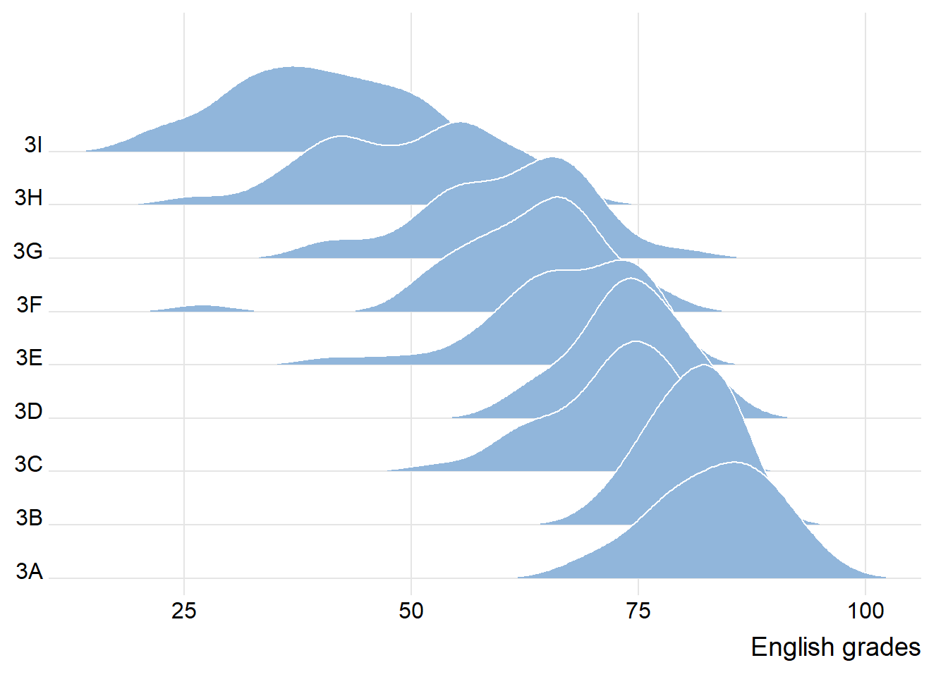
observation: each peak point of each group, the spread of each group and the tendency of the line linking all peak points
2.2.2 Change fill colors
geom_ridgeline_gradient(): make the area under a ridgeline filled with colors that vary in some form along the x axis (do not allow for alpha transparency in the fill)
geom_density_ridges_gradient(): make the area under a ridgeline filled with colors that vary in some form along the x axis (do not allow for alpha transparency in the fill)
ggplot(exam,
       aes(x=ENGLISH,
           y=CLASS,
           fill=stat(x)))+
  geom_density_ridges_gradient(
    scale=3,
    rel_min_height=0.01)+
  scale_fill_viridis_c(name="Temp. [F]",
                       option="C")+
  scale_x_continuous(
    name="English grades",
    expand=c(0,0))+
  scale_y_discrete(name=NULL,
                   expand=expansion(add=c(0.2,2.6)))+
  theme_ridges()
2.2.3 Map the probabilities onto color
- stat_density_ridges(): provides a stat function
ggplot(exam,
       aes(x=ENGLISH,
           y=CLASS,
           fill=0.5-abs(0.5-stat(ecdf))))+
  stat_density_ridges(geom="density_ridges_gradient",
                      calc_ecdf=TRUE)+
  scale_fill_viridis_c(name="Tail probability",
                       direction = -1)+
  theme_ridges()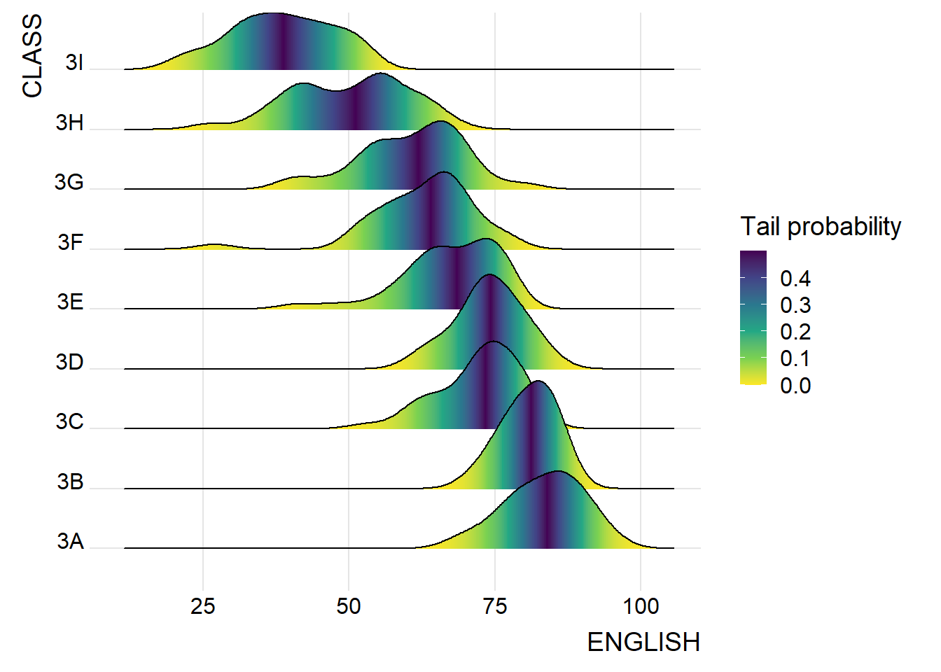
2.2.4 Add quantile lines to ridgeline plots
ggplot(exam,
       aes(x = ENGLISH,
           y = CLASS,
           fill = factor(stat(quantile))
           )) +
  stat_density_ridges(
    geom = "density_ridges_gradient",
    calc_ecdf = TRUE,
    quantiles = 4,
    quantile_lines = TRUE) +
  scale_fill_viridis_d(name = "Quartiles") +
  theme_ridges()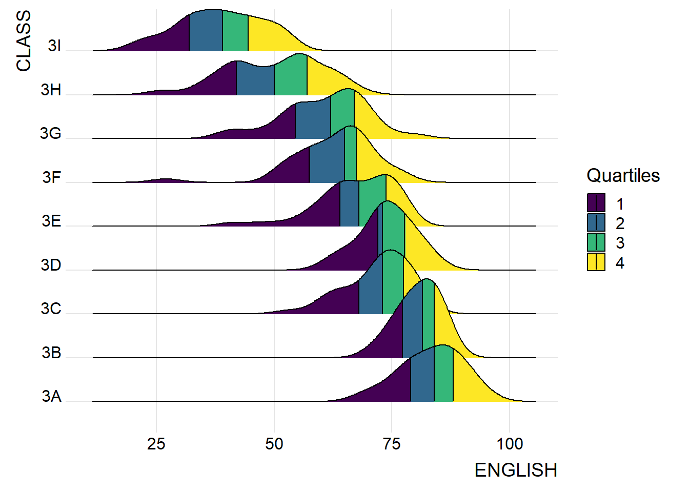
Instead of using number to define the quantiles, we can also specify quantiles by cut points such as 2.5% and 97.5% tails to colour the ridgeline plot as shown in the figure below.
ggplot(exam,
       aes(x=ENGLISH,
           y=CLASS,
           fill=factor(stat(quantile))))+
  stat_density_ridges(
    geom="density_ridges_gradient",
    calc_ecdf=TRUE,
    quantiles=c(0.025,0.975))+
  scale_fill_manual(
    name="Probability",
    values=c("#FF0000A0", "#A0A0A0A0", "#0000FFA0"),
    labels=c("(0, 0.025]", "(0.025, 0.975]", "(0.975, 1]"))+
  theme_ridges()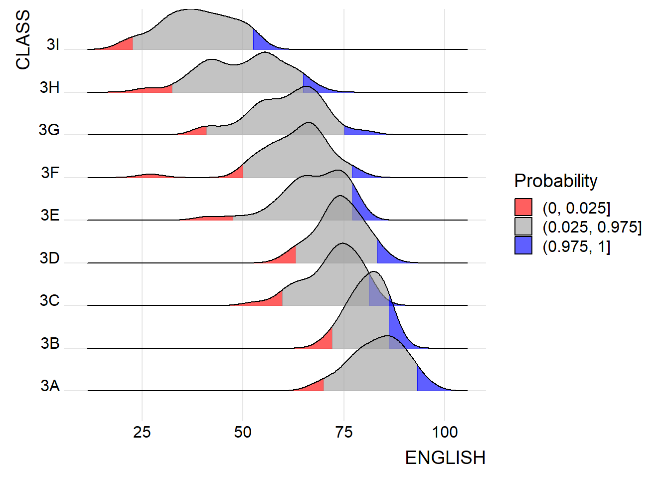
2.3 Visualize Distribution with Raincloud Plot
Raincloud Plot produces a half-density to a distribution plot.
- used to compare the distribution of a continuous variable in terms of different groups
- highlight multiple modalities (an indicator that groups may exist)
2.3.1 Plot a Half Eye graph
- stat_halfeye(): produces a Half Eye visualization, which is contains a half-density and a slab-interval.
ggplot(exam,
       aes(x=RACE,
           y=ENGLISH))+
  stat_halfeye(adjust=0.5,
               justification=-0.2,
               .width=0,
               point_colour=NA)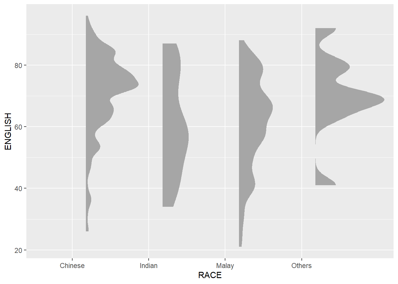
2.3.2 Add the boxplot with geom_boxplot()
ggplot(exam,
       aes(x=RACE,
           y=ENGLISH))+
  stat_halfeye(adjust=0.5,
               justification=-0.2,
               .width=0,
               point_colour=NA)+
  geom_boxplot(width=.20,
               outlier.shape=NA)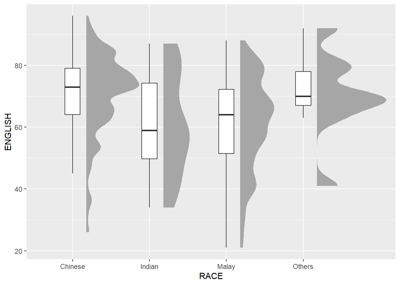
2.3.3 Add the dot plot with geom_dots()
- stat_dots(): produces a half-dotplot, which is similar to a histogram that indicates the number of data points in each bin
ggplot(exam,
       aes(x=RACE,
           y=ENGLISH))+
  stat_halfeye(adjust=0.5,
               justification=-0.2,
               .width=0,
               point_colour=NA)+
  geom_boxplot(width=.20,
               outlier.shape=NA)+
  stat_dots(side="left",
            justification=1.2,
            binwidth=.5,
            dotsize=2)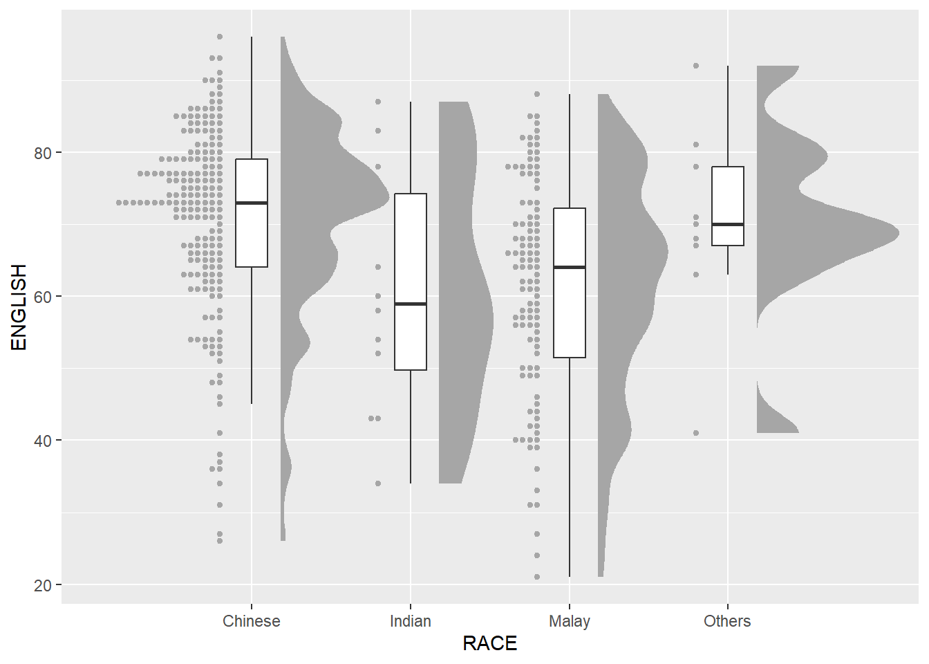
2.3.4 Flip horizontally
ggplot(exam,
       aes(x=RACE,
           y=ENGLISH))+
  stat_halfeye(adjust=0.5,
               justification=-0.2,
               .width=0,
               point_colour=NA)+
  geom_boxplot(width=.20,
               outlier.shape=NA)+
  stat_dots(side="left",
            justification=1.2,
            binwidth=.5,
            dotsize=2)+
  coord_flip()+
  theme_economist()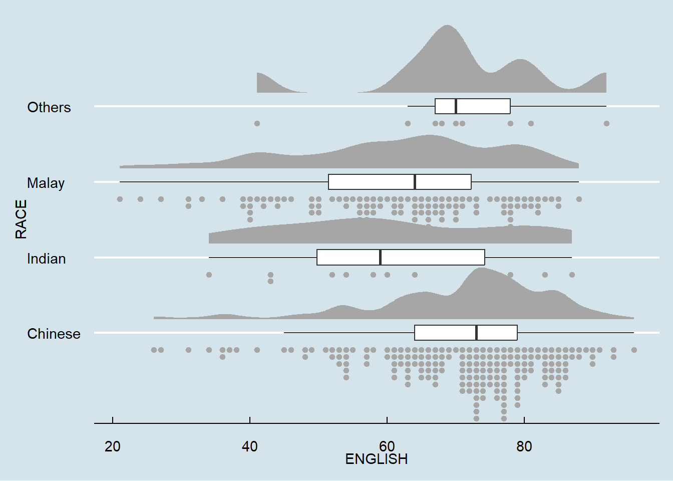
3. Visual Statistical Analysis
3.1 Getting Started
3.1.1 Install and Launch R package
- ggstatsplot: create graphics with details from statistical tests included in the information-rich plots themselves
Learn more about ggstatsplot on ggstatsplot
pacman::p_load(ggstatsplot, tidyverse)3.1.2 Import Data
exam <- read.csv("Data/Exam_data.csv")3.2 One-sample test: gghistostats() method
set.seed(1234)

gghistostats(
  data=exam,
  x=ENGLISH,
  type="bayes",
  test.value=60,
  xlab="English scores"
)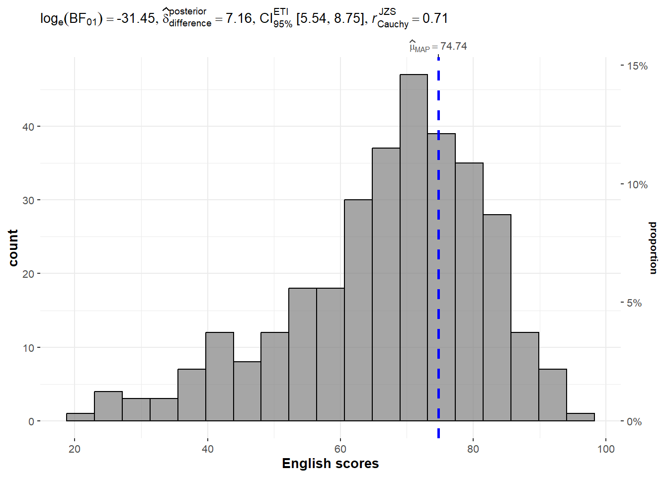
3.3 Bayes Factor
A Bayes factor is the ratio (positive number) of the likelihood of one particular hypothesis to the likelihood of another. It can be interpreted as a measure of the strength of evidence in favor of one theory among two competing theories
Example:
- You have two competing options or hypotheses. Let’s call them Option A and Option B.
- You collect some data or evidence. The Bayes Factor helps you assess how well the data supports Option A versus Option B.
- The Bayes Factor gives you a ratio. If the Bayes Factor is greater than 1, it means the data supports Option A more than Option B. If it’s less than 1, it means the data supports Option B more than Option A.
- The bigger the Bayes Factor, the stronger the evidence in favor of one option. A Bayes Factor of 10 means the data strongly supports one option over the other.
- The smaller the Bayes Factor, the weaker the evidence. A Bayes Factor of 0.1 means the data weakly supports one option over the other.
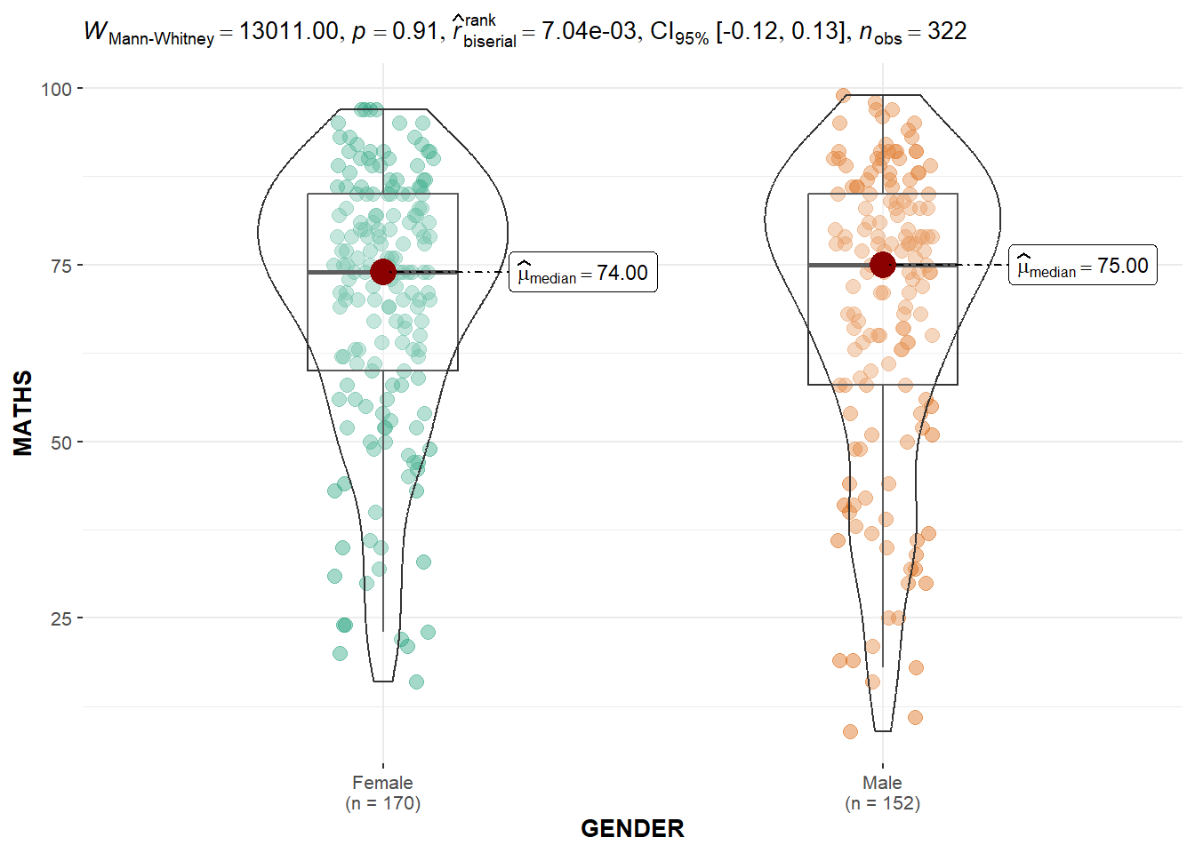
3.4 Two-sample mean test: ggbetweenstats() method
ggbetweenstats(
  data=exam,
  x=GENDER,
  y=MATHS,
  type="np",
  message=FALSE
)
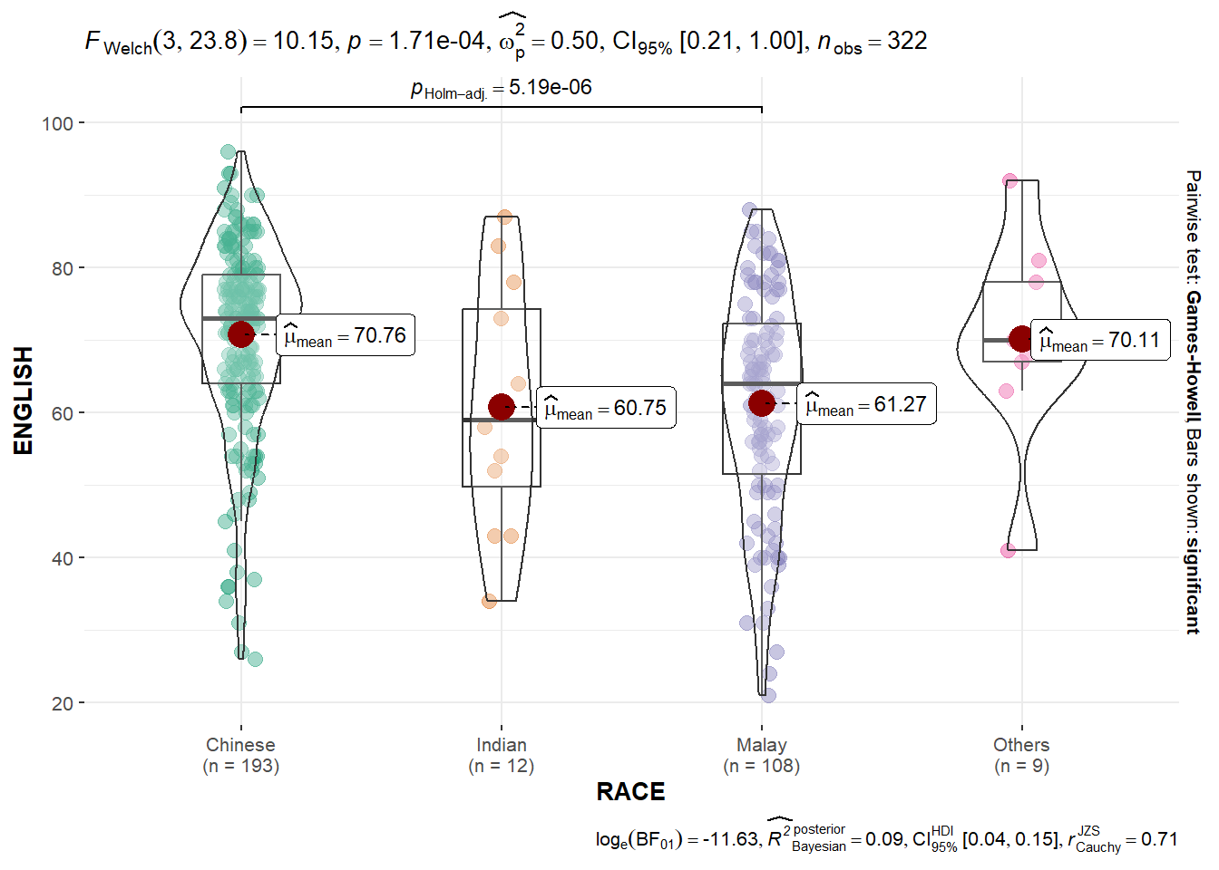
3.5 Oneway ANOVA test: ggbetweenstats() method
ggbetweenstats(
  data=exam,
  x=RACE,
  y=ENGLISH,
  type="p",
  mean.ci=TRUE,
  pairwise.comparisons=TRUE,
  pairwise.display = "s",
  pairwise.method="fdr",
  messages=FALSE
)
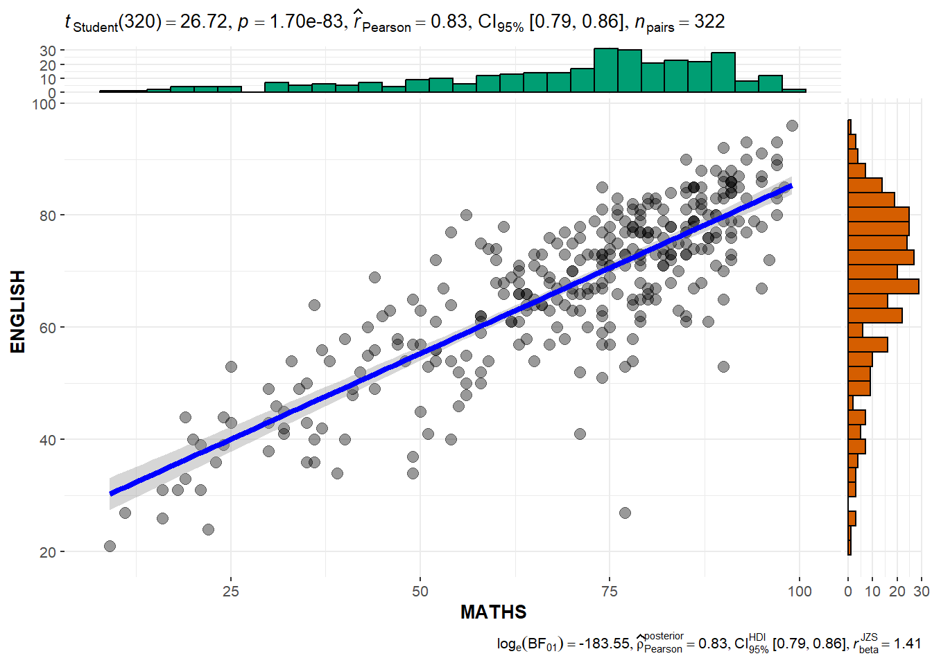
3.6 Significant test of Correlation: ggscatterstats()
ggscatterstats(
  data=exam,
  x=MATHS,
  y=ENGLISH,
  marginal=TRUE
)
3.7 Significant test of Association: ggbarstats()
- data wrangling: the Maths scores is binned into a 4-class variable by using
cut()
exam1 <- exam %>%
  mutate(MATHS_bins =
           cut(MATHS,
breaks = c(0,60,75,85,100)))- Association test
ggbarstats(exam1,
           x=MATHS_bins,
           y=GENDER)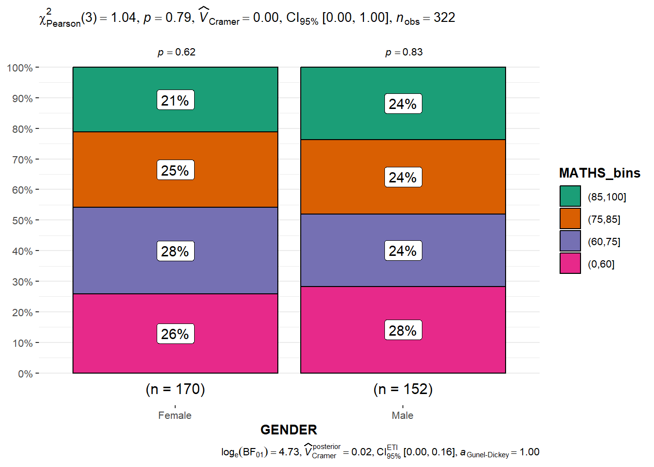
4. Visualize model diagnostic and model parameters
4.1 Getting Started
4.1.1 Install and load R packages
performance: for assessing and checking the quality of statistical models. It contains functions for computing various performance metrics, model diagnostics, and checks for regression models, among others.
parameters: for processing the parameters of statistical models. It provides functions to summarize, manipulate, and plot model parameters and supports a wide range of models.
see: to create plots and visualizations for statistical models and data structures. It works well with the
performanceandparameterspackages, among others, to create attractive and informative plots.
pacman::p_load(readxl,performance,parameters,see)4.1.2 Import Data
car_resale <- read_xls("Data/ToyotaCorolla.xls","data")
car_resale
# A tibble: 1,436 × 38
Id Model Price Age_08_04 Mfg_Month Mfg_Year KM Quarterly_Tax Weight
<dbl> <chr> <dbl> <dbl> <dbl> <dbl> <dbl> <dbl> <dbl>
1 81 TOYOTA … 18950 25 8 2002 20019 100 1180
2 1 TOYOTA … 13500 23 10 2002 46986 210 1165
3 2 TOYOTA … 13750 23 10 2002 72937 210 1165
4 3 TOYOTA… 13950 24 9 2002 41711 210 1165
5 4 TOYOTA … 14950 26 7 2002 48000 210 1165
6 5 TOYOTA … 13750 30 3 2002 38500 210 1170
7 6 TOYOTA … 12950 32 1 2002 61000 210 1170
8 7 TOYOTA… 16900 27 6 2002 94612 210 1245
9 8 TOYOTA … 18600 30 3 2002 75889 210 1245
10 44 TOYOTA … 16950 27 6 2002 110404 234 1255
# ℹ 1,426 more rows
# ℹ 29 more variables: Guarantee_Period <dbl>, HP_Bin <chr>, CC_bin <chr>,
# Doors <dbl>, Gears <dbl>, Cylinders <dbl>, Fuel_Type <chr>, Color <chr>,
# Met_Color <dbl>, Automatic <dbl>, Mfr_Guarantee <dbl>,
# BOVAG_Guarantee <dbl>, ABS <dbl>, Airbag_1 <dbl>, Airbag_2 <dbl>,
# Airco <dbl>, Automatic_airco <dbl>, Boardcomputer <dbl>, CD_Player <dbl>,
# Central_Lock <dbl>, Powered_Windows <dbl>, Power_Steering <dbl>, …4.2 Build Multiple Regression Model using lm()
model <- lm(Price ~ Age_08_04 + Mfg_Year + KM + Weight + Guarantee_Period, data = car_resale)
model
Call:
lm(formula = Price ~ Age_08_04 + Mfg_Year + KM + Weight + Guarantee_Period,
    data = car_resale)

Coefficients:
     (Intercept)         Age_08_04          Mfg_Year                KM
      -2.637e+06        -1.409e+01         1.315e+03        -2.323e-02
          Weight  Guarantee_Period
       1.903e+01         2.770e+01
The output equation is: Price = -14.09Age_08_04+1315Mfg_Year-232.3KM+19.03Weight+27.7Guarantee_Period
4.3 Model Diagnostic: check multicolinearity
Multicolinearity: several independent varaiables in a model are correlated
check_collinearity(model)# Check for Multicollinearity
Low Correlation
Term VIF VIF 95% CI Increased SE Tolerance Tolerance 95% CI
KM 1.46 [ 1.37, 1.57] 1.21 0.68 [0.64, 0.73]
Weight 1.41 [ 1.32, 1.51] 1.19 0.71 [0.66, 0.76]
Guarantee_Period 1.04 [ 1.01, 1.17] 1.02 0.97 [0.86, 0.99]
High Correlation
Term VIF VIF 95% CI Increased SE Tolerance Tolerance 95% CI
Age_08_04 31.07 [28.08, 34.38] 5.57 0.03 [0.03, 0.04]
Mfg_Year 31.16 [28.16, 34.48] 5.58 0.03 [0.03, 0.04]Plot the collinearity in terms of VIF
check_c <- check_collinearity(model)
plot(check_c)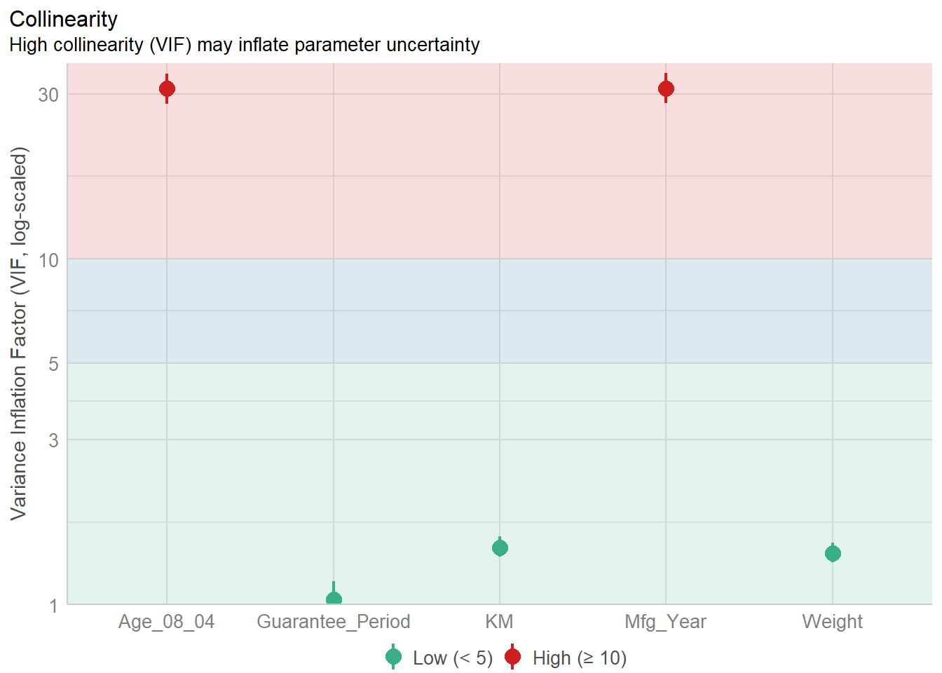
4.4 Model Diagnostic: Check normality assumption
Normality assumption: when performing statistical tests that rely on the assumption of normally distributed residuals (like t-tests for coefficients), it is required to check if the data points follow a standard normal distribution in advance.
model1 <- lm(Price ~ Age_08_04+KM+Weight+Guarantee_Period,
             data=car_resale)
check_n <- check_normality(model1)
plot(check_n)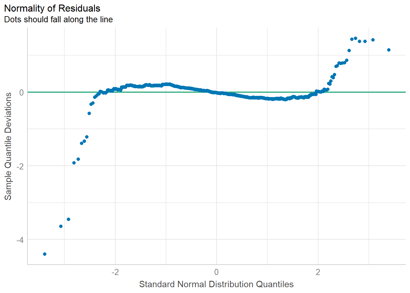
4.5 Model Diagnostic: Check homogeneity of variances
homogeneity of variances means “equal spread” or “equal variability” of different groups. It refers to the consistency of the spread or variance of the residuals across all levels of the independent variables.
when you are doing an experiment or a study, you often want to make sure that the groups you are comparing are similar in terms of how spread out their data is. If one group has data that is all over the place and another group’s data is very tightly packed, it could be a problem for certain types of statistical tests which assume that the variances are equal across all groups being compared.
Example:
Imagine you’re trying to predict the scores of students on a math test using the number of hours they studied. After everyone takes the test, you compare your predictions to the actual scores—the differences are called “residuals.”
If your predictions are equally reliable for students who studied a little and students who studied a lot, then the spread of those residuals will be pretty consistent. This is like saying whether a student studied for 2 hours or 10 hours, your prediction might be off by about 3 points on average either way. This consistency in prediction error is what we mean by “homogeneity of variance.”
If you notice that for students who studied a little, your predictions are really close, but for students who studied a lot, your predictions are way off—maybe you’re underestimating their scores. This means the spread of the residuals isn’t consistent. For those who studied a little, the residuals are small and clustered close together. For those who studied a lot, the residuals are large and spread out. This inconsistency is what we’d call “heteroscedasticity.”
“homogeneity of variance” means your prediction mistakes are about the same size no matter how much someone studied. If that’s not the case, and your mistakes vary a lot depending on how much they studied, then there’s a problem with “heteroscedasticity”.
Reasons for heteroscedasticity:
- Non-Linear Relationship: The relationship between study time and scores isn’t straight-line (linear).
- Missing Factors: There could be other factors that affect scores in addition to study time.
- Study Time Measurement: Perhaps “study time” isn’t measured in the best way. For example, just counting hours might not take into account the quality of the study.
- Extreme Values: There might be students with very high or very low study times that are affecting the prediction errors. These could be outliers, and they might need special attention in your analysis.
- Incorrect Model: You might be using the wrong type of model to make your predictions. Maybe the relationship between study time and scores is more complex than the model you’re using can handle.
check_h <- check_heteroscedasticity(model1)
plot(check_h)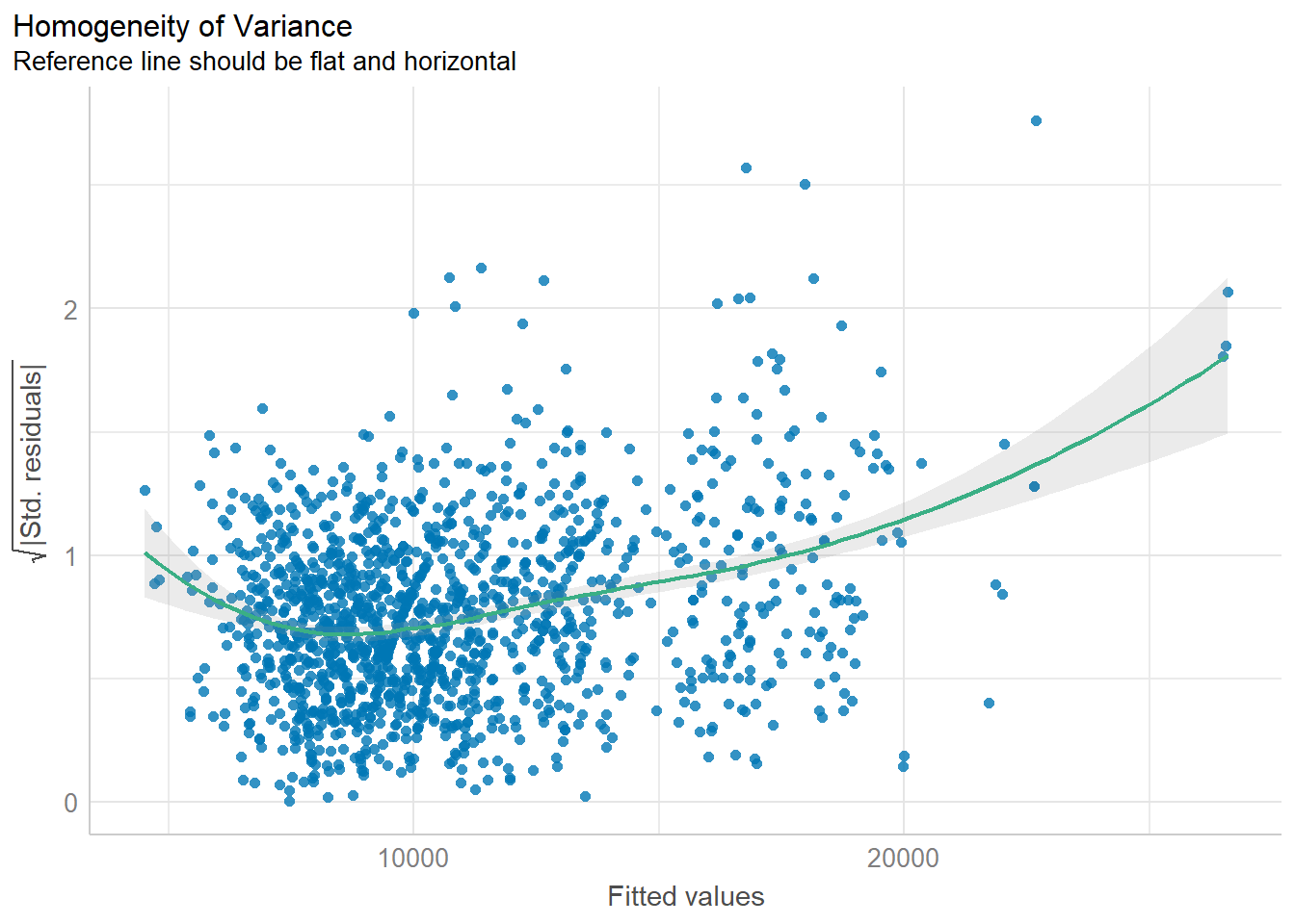
4.6 Model Diagnostic: Complete check
To create a composite checks on a statistical model.
check_model(model1)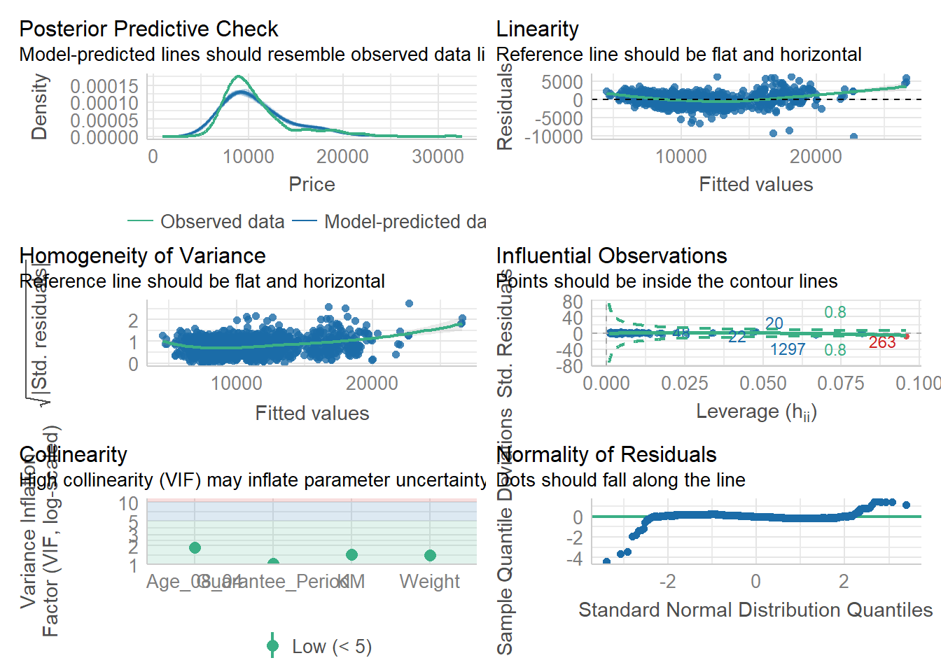
4.7 Visualize Regression Parameters: see methods
To display the point estimates and confidence intervals of the parameters (coefficients) from a statistical model.
plot(parameters(model1))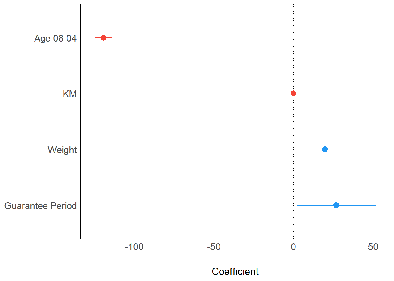
4.8 Visualize Regression Parameters: ggcoefstats() methods
pacman::p_load(ggstatsplot)
ggcoefstats(model1, output="plot")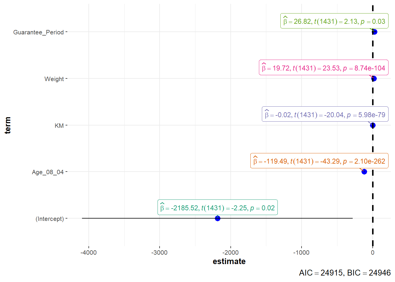
5. Visualize Uncertainty
5.1 Concept
Estimate: a best guess. In order to learn something about the whole population, we take a smaller group (sample), collect data, look at that, and then make an educated guess or estimate about the larger population based on what we see in the sample.
- Point Estimate: the single best guess.
- Interval Estimate: a range of numbers where the true answer might fall.
Uncertainty: about how confident we are in our estimates after multiple sampling tests.
- Confidence Interval: indicate the uncertainty of estimated value, meaning whether the results will point to a certain range after many times of sampling test.
- Large confidence interval: the result of multiple tests is more discrete which is pointing to a large range, so the uncertainty of that estimate is large
- Small confidence interval: the result of multiple tests is more concentrated which is pointing to a small range, so the uncertainty of that estimate is small
- Note: uncertainty of estimated value is not equal to accuracy of estimated value to the actual value.
Accuracy: how close is the distance between estimated values or ranges and the actual values.
- Confidence Level: indicate the accuracy of estimated value to the actual value, meaning how many times the estimated results of sampling tests include the actual values
- High confidence level: the actual values fall in almost every estimated ranges of each test
- Low confidence level: the actual values fall in few estimated ranges of tests
Confidence Level vs Confidence Interval:
The higher the confidence level, the wider the confidence interval
Confidence level of 99% doesn’t mean to be better than that of 95%
5.2 Getting Started
5.2.1 Install and load packages
The packages used for this exercise include:
tidyverse, a family of R packages for data science process
plotly for creating interactive plot
gganimate for creating animation plot
DT for displaying interactive html table
crosstalk for for implementing cross-widget interactions (currently, linked brushing and filtering)
ggdist for visualising distribution and uncertainty
devtools::install_github("wilkelab/ungeviz")pacman::p_load(ungeviz,plotly,crosstalk,DT,
ggdist,ggridges,colorspace,
gganimate,tidyverse)5.2.2 Import data
exam <- read_csv("data/Exam_data.csv")5.3 Visualize uncertainty: ggplot2 methods
Uncertainty of point estimate is not equal to confidence interval. Uncertainty of point estimate is not equal to Variation in the sample.
Uncertainty of point estimate: quantifies how much the estimate might vary if different samples were taken from the same population.
Confidence interval: quantifies the uncertainty about the true parameter value by providing a range of plausible values.
Variation in the sample: is commonly measured by standard deviation.
5.3.1 Derive necessary summary statistics from data
Calculate mean, standard deviation and standard error of the mean from data.
my_sum <- exam %>%
  group_by(RACE) %>%
  summarise(
    n=n(),
    mean=mean(MATHS),
    sd=sd(MATHS)
  ) %>%
mutate(se=sd/sqrt(n-1))Display tibble data frame in an html table format.
An HTML table format refers to the way tables are structured and displayed in HTML (Hypertext Markup Language), which is the standard markup language for creating web pages and web applications. Different from tables created in non-web-based environments, HTML tables can be styled extensively with CSS and manipulated with JavaScript, serves as interactive components in forms, data visualizations, and more.
knitr::kable(head(my_sum),format = 'html')| RACE | n | mean | sd | se |
|---|---|---|---|---|
| Chinese | 193 | 76.50777 | 15.69040 | 1.132357 |
| Indian | 12 | 60.66667 | 23.35237 | 7.041005 |
| Malay | 108 | 57.44444 | 21.13478 | 2.043177 |
| Others | 9 | 69.66667 | 10.72381 | 3.791438 |
5.3.2 Plot standard error bars of point estimates
ggplot(my_sum)+
  geom_errorbar(
    aes(x=RACE,
        ymin=mean-se,
        ymax=mean+se),
    width=0.2,
    colour="black",
    alpha=0.9,
    size=0.5)+
  geom_point(aes(x=RACE,y=mean),
             stat="identity",
             color="red",
             size=1.5,
             alpha=1)+
  ggtitle("Standard error of mean maths score by race")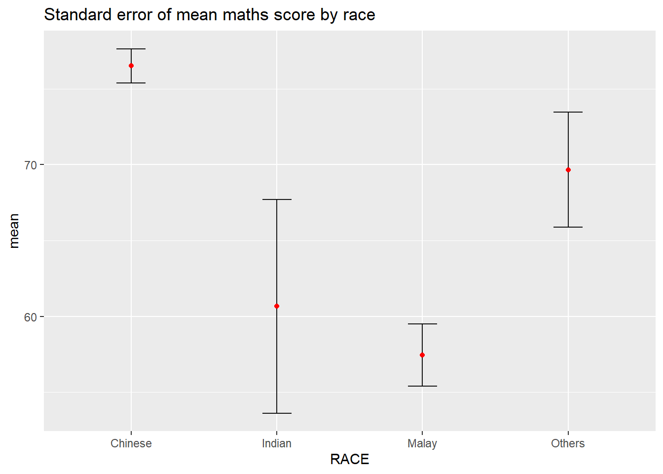
5.3.3 Plot confidence interval
ggplot(my_sum)+
  geom_errorbar(
    aes(x=reorder(RACE,-mean),
        ymin=mean-1.96*se,
        ymax=mean+1.96*se),
    width=0.2,
    colour="black",
    alpha=0.9,
    size=0.5)+
  geom_point(aes(x=RACE,y=mean),
             stat="identity",
             color="red",
             size=1.5,
             alpha=1)+
  labs(x="Math score",title="95% confidence interval of mean maths score by race")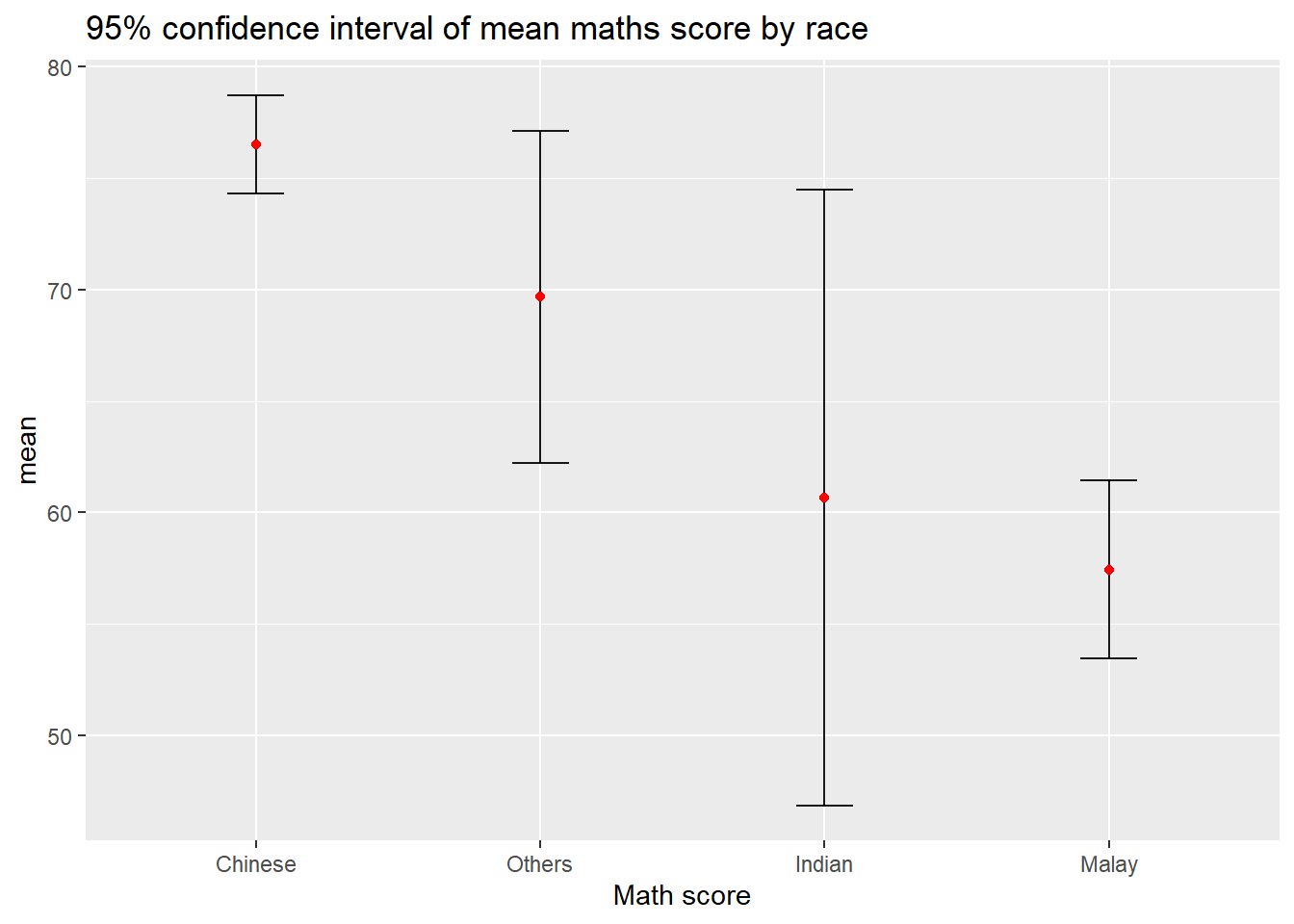
5.3.4 Plot confidence interval interactive with table
shared_df = SharedData$new(my_sum)

bscols(widths = c(4,8),
       ggplotly((ggplot(shared_df) +
                   geom_errorbar(aes(
                     x=reorder(RACE, -mean),
                     ymin=mean-2.58*se,
                     ymax=mean+2.58*se),
                     width=0.2,
                     colour="black",
                     alpha=0.9,
                     size=0.5) +
                   geom_point(aes(
                     x=RACE,
                     y=mean,
                     text = paste("Race:", `RACE`,
                                  "<br>N:", `n`,
                                  "<br>Avg. Scores:", round(mean, digits = 2),
                                  "<br>95% CI:[",
                                  round((mean-2.58*se), digits = 2), ",",
                                  round((mean+2.58*se), digits = 2),"]")),
                     stat="identity",
                     color="red",
                     size = 1.5,
                     alpha=1) +
                   xlab("Race") +
                   ylab("Average Scores") +
                   theme_minimal() +
                   theme(axis.text.x = element_text(
                     angle = 45, vjust = 0.5, hjust=1)) +
                   ggtitle("99% Confidence interval of average /<br>maths scores by race")),
                tooltip = "text"),
       DT::datatable(shared_df,
                     rownames = FALSE,
                     class="compact",
                     width="100%",
                     options = list(pageLength = 10,
                                    scrollX=T),
                     colnames = c("No. of pupils",
                                  "Avg Scores",
                                  "Std Dev",
                                  "Std Error")) %>%
         formatRound(columns=c('mean', 'sd', 'se'),
digits=2))5.4 Visualize uncertainty: ggdist methods
ggdist is designed for both frequentist and Bayesian uncertainty visualization, taking the view that uncertainty visualization can be unified through the perspective of distribution visualization.
Frequentist Model: probabilities are based on the frequency of events. It relies on the idea that if you repeat an experiment infinitely many times, the relative frequency of an event will converge to its true probability. It relies solely on observed data for inference.
Bayesian Model: probabilities represent a degree of belief or uncertainty. It incorporates prior beliefs about the parameters being estimated along with the observed data to update and refine those beliefs. It incorporates both prior beliefs and observed data, updating beliefs as new data becomes available.
5.4.1 Visualize confidence interval of mean: ggdist methods (stat_pointinterval)
exam %>%
  ggplot(aes(x=RACE,
             y=MATHS))+
  stat_pointinterval()+
  labs(
    title="Visualizing confidence intervals of mean maths score",
    subtitle="Mean Point + Multiple-interval plot")
Add arguments within stat_pointinterval()
exam %>%
  ggplot(aes(x=RACE,
             y=MATHS))+
  stat_pointinterval(.width=0.95,
                     .point=median,
                     .interval=qi)+
  labs(
    title="Visualizing confidence intervals of median maths score",
    subtitle="Median Point + Multiple-interval plot")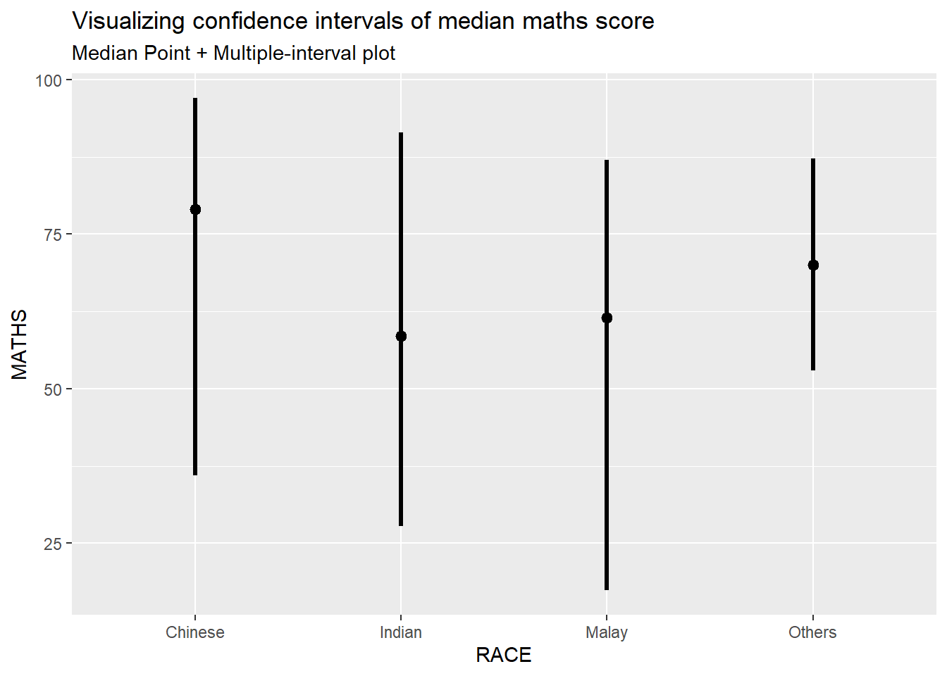
5.4.2 Visualize confidence interval of mean in different confidence level: ggdist methods (stat_pointinterval)
exam %>%
  ggplot(aes(x = RACE,
             y = MATHS)) +
  stat_pointinterval(
    conf.level = 0.90,
    show.legend = FALSE) +
  labs(
    title = "Visualising confidence intervals of mean math score",
    subtitle = "Mean Point + Multiple-interval plot")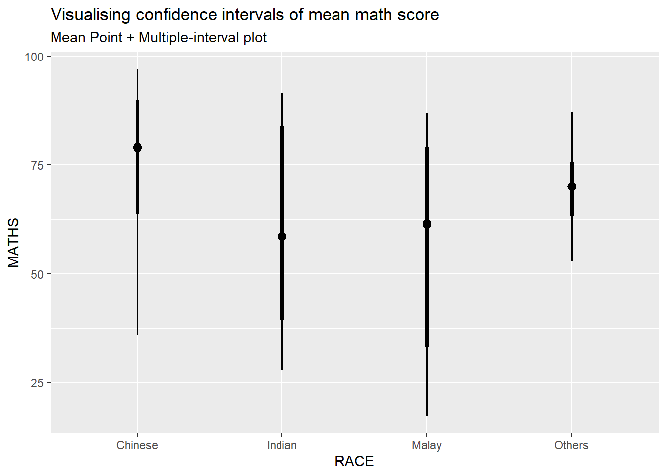
5.4.3 Visualize confidence interval of mean: ggdist methods (stat_gradientinterval)
exam %>%
  ggplot(aes(x = RACE,
             y = MATHS)) +
  stat_gradientinterval(
    fill = "skyblue",
    show.legend = TRUE
  ) +
  labs(
    title = "Visualising confidence intervals of mean math score",
    subtitle = "Gradient + interval plot")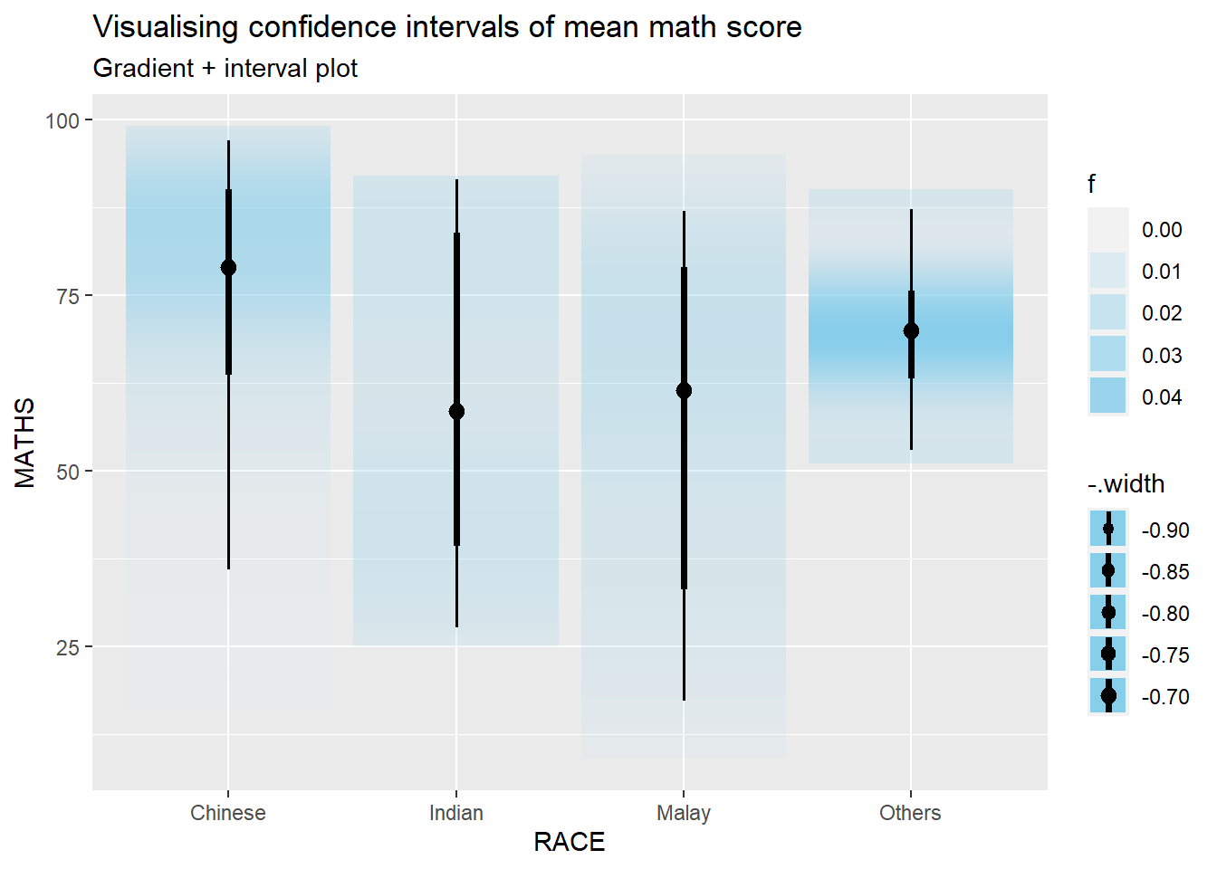
5.5 Visualize uncertainty: Hypothetical Outcome Plots (HOPs)
Hypothetical Outcome Plots (HOPs) are a way of showing how different decisions or actions might lead to different outcomes. They’re often used in decision-making or scenario analysis. They’re useful for exploring scenarios, making decisions, and understanding the potential consequences of our choices.
library(ungeviz)

ggplot(data = exam,
       (aes(x = factor(RACE), y = MATHS))) +
  geom_point(position = position_jitter(
    height = 0.3, width = 0.05),
    size = 0.4, color = "#0072B2", alpha = 1/2) +
  geom_hpline(data = sampler(25, group = RACE), height = 0.6, color = "#D55E00") +
  theme_bw() +
  # `.draw` is a generated column indicating the sample draw
  transition_states(.draw, 1, 3)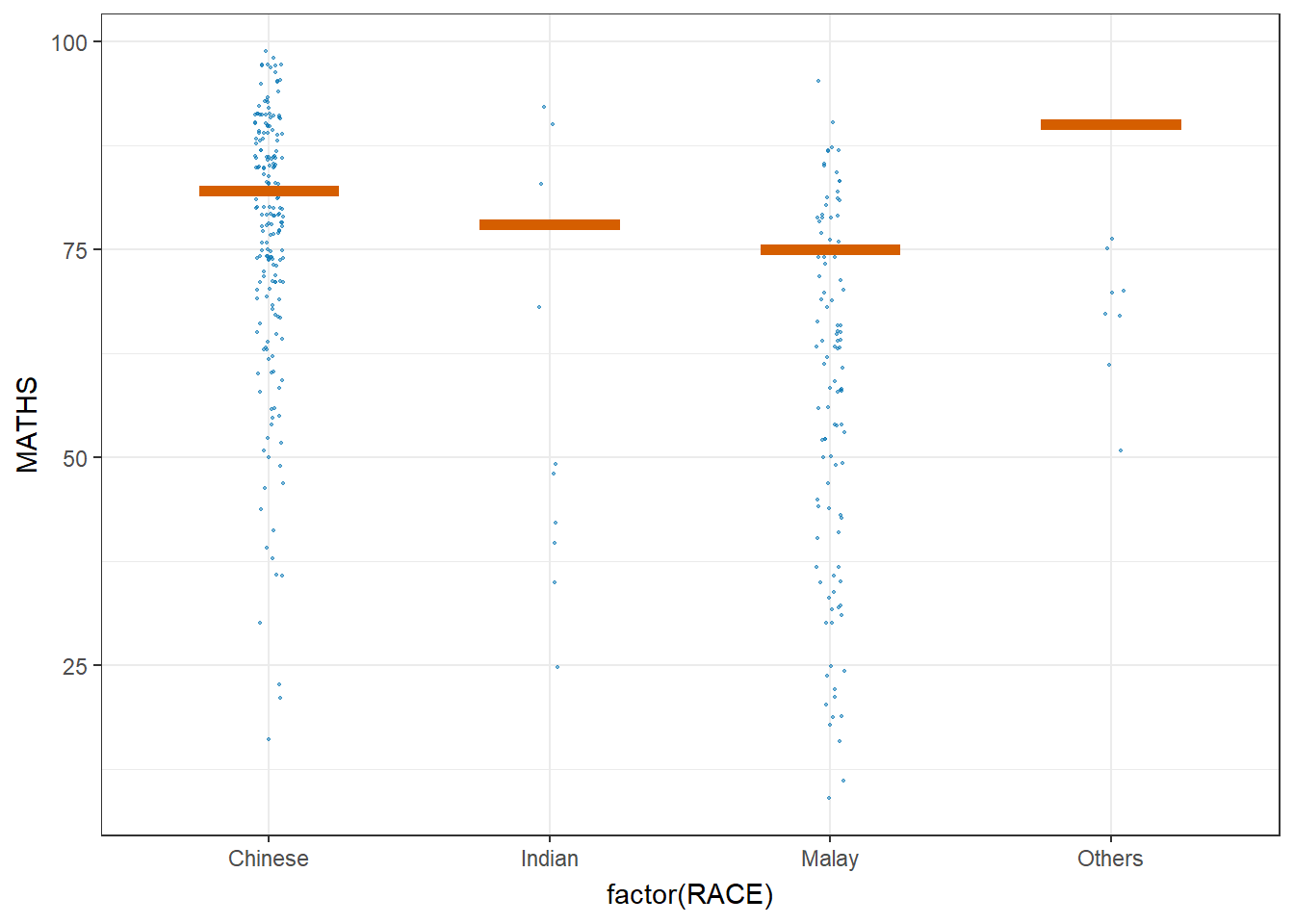
6. Build Funnel Plot for fair comparisons
Funnel plot is a specially designed data visualisation for conducting unbiased comparison between outlets, stores or business entities.
6.1 Getting Started
6.1.1 Install and load packages
The packages used in this exercise include:
readr for importing csv into R.
FunnelPlotR for creating funnel plot.
ggplot2 for creating funnel plot manually.
knitr for building static html table.
plotly for creating interactive funnel plot.
pacman::p_load(tidyverse,FunnelPlotR,plotly,knitr)6.1.2 Import data
covid19 <- read_csv("data/COVID-19_DKI_Jakarta.csv") %>%
  mutate_if(is.character, as.factor)
For this hands-on exercise, we are going to compare the cumulative COVID-19 cases and death by sub-district (i.e. kelurahan) as at 31st July 2021, DKI Jakarta.
6.2 FunnelPlotR methods
FunnelPlotR package uses ggplot to generate funnel plots. It requires a numerator (events of interest), denominator (population to be considered) and group. The key arguments selected for customisation are:
limit: specify the plot limits, either at the 95% confidence level or the 99% confidence level. This determines the width of the funnel plot and the corresponding confidence intervals around the summary measure.label_outliers: When set to true, this argument will label outliers on the funnel plot.Poisson_limits: Setting this argument to true adds Poisson limits to the plot. Poisson limits are calculated based on the assumption that the events of interest follow a Poisson distribution. These limits help assess whether observed variation in event rates is within the range of random chance.Poisson Distribution: describe the number of events that occur within a fixed interval of time or space, given a known average rate of occurrence and the assumption that the events happen independently of each other. When dealing with funnel plots, we often want to assess whether observed variations in event rates (like mortality rates, complication rates, etc.) are within the range of random chance or if they might indicate something significant. Poisson limits in the context of funnel plots help us with this assessment by setting boundaries to check whether the observed data points are within what we’d expect from random variation alone. If data points fall outside these Poisson limits, it suggests that there might be factors other than chance affecting the event rates and warrants further investigation.
OD_adjust: This argument adds overdispersed limits to the plot when set to true. Overdispersion occurs when there is more variability in the data than expected based on a Poisson distribution.xrangeandyrange: specify the range to display for the x-axis and y-axis, respectively. They act as a zoom function, allowing you to focus on a specific region of interest within the funnel plot.
6.2.1 FunnelPlotR methods: The basic plot
funnel_plot(
  numerator = covid19$Positive,
  denominator = covid19$Death,
  group = covid19$`Sub-district`
)
A funnel plot object with 267 points of which 0 are outliers.
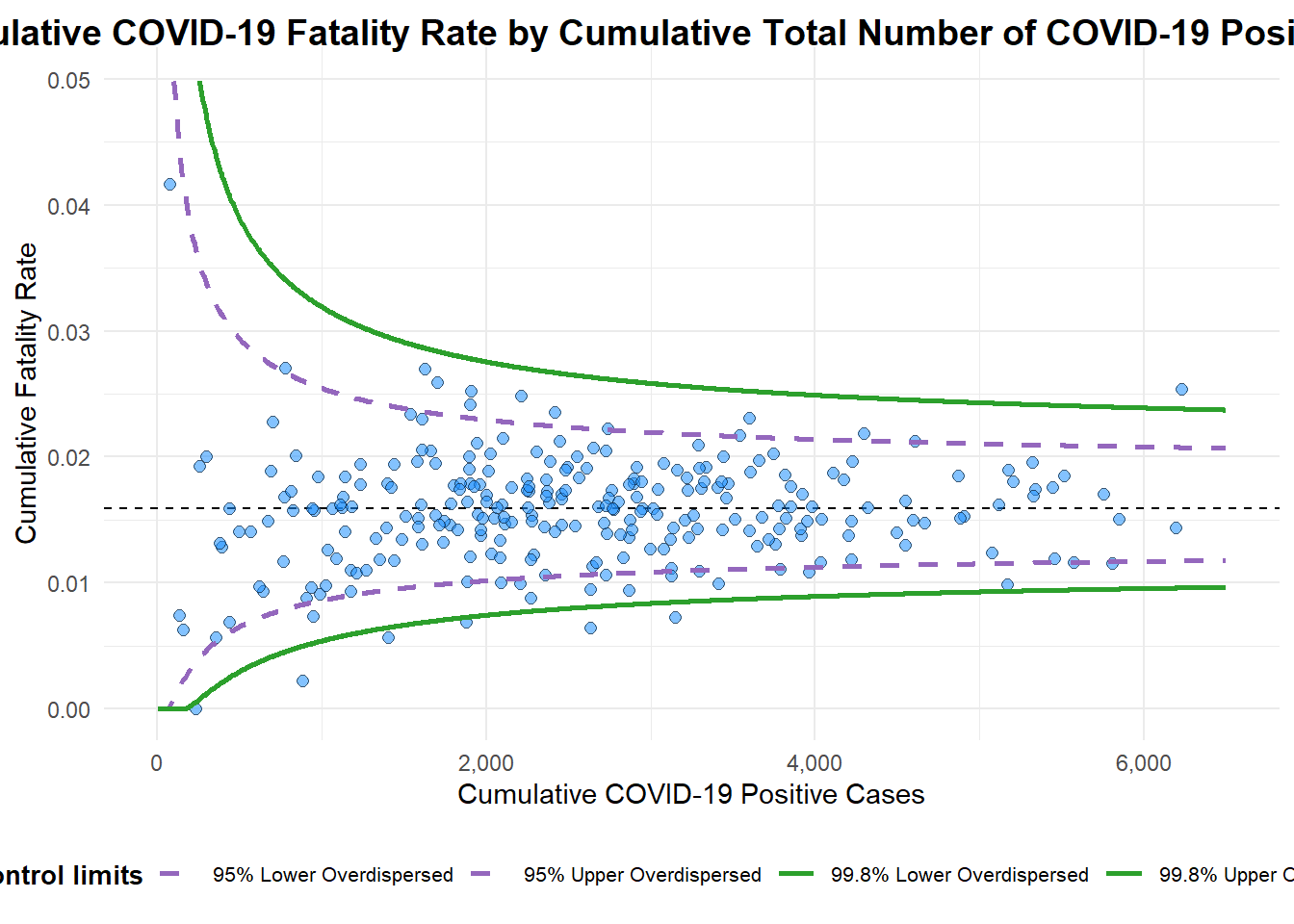
Plot is adjusted for overdispersion. 6.2.2 FunnelPlotR methods: Makeover 1
funnel_plot(
  numerator = covid19$Death,
  denominator = covid19$Positive,
  group = covid19$`Sub-district`,
  data_type = "PR",     #<<
  xrange = c(0, 6500),  #<<
  yrange = c(0, 0.05)   #<<
)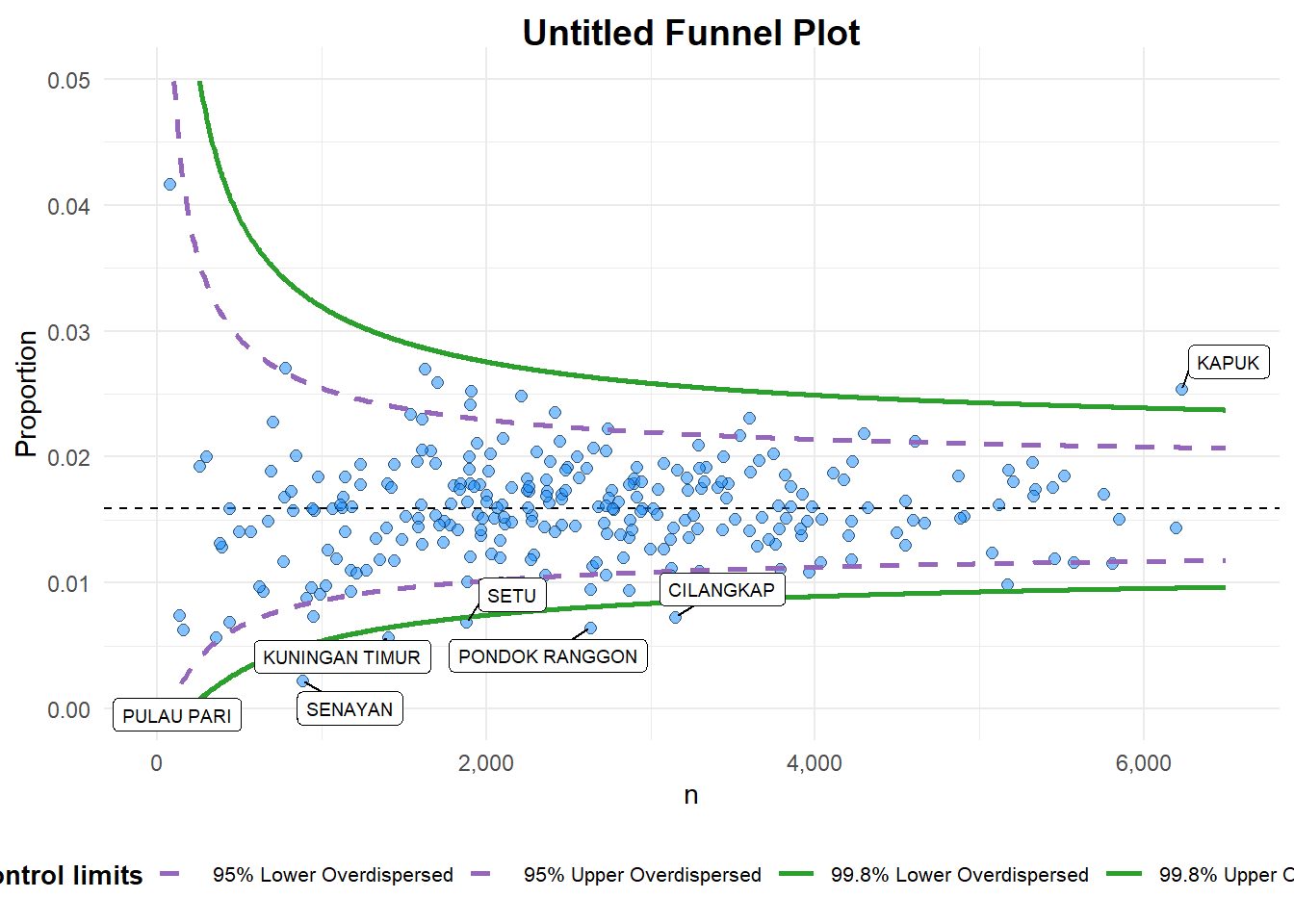
A funnel plot object with 267 points of which 7 are outliers.
Plot is adjusted for overdispersion. 6.2.3 FunnelPlotR methods: Makeover 2
funnel_plot(
  numerator = covid19$Death,
  denominator = covid19$Positive,
  group = covid19$`Sub-district`,
  data_type = "PR",
  xrange = c(0, 6500),
  yrange = c(0, 0.05),
  label = NA,
  title = "Cumulative COVID-19 Fatality Rate by Cumulative Total Number of COVID-19 Positive Cases", #<<
  x_label = "Cumulative COVID-19 Positive Cases", #<<
  y_label = "Cumulative Fatality Rate"  #<<
)
A funnel plot object with 267 points of which 7 are outliers.
Plot is adjusted for overdispersion.
6.3 Funnel Plot for Fair Visual Comparison: ggplot2 methods
6.3.1 Compute the basic derived fields
Derive cumulative death rate and standard error of cumulative death rate.
df <- covid19 %>%
  mutate(rate = Death / Positive) %>%
  mutate(rate.se = sqrt((rate*(1-rate)) / (Positive))) %>%
  filter(rate > 0)
Derive weighted mean of death rate.
fit.mean <- weighted.mean(df$rate, 1/df$rate.se^2)6.3.2 Calculate lower and upper limits for 95% and 99.9% CI
number.seq <- seq(1, max(df$Positive), 1)
number.ll95 <- fit.mean - 1.96 * sqrt((fit.mean*(1-fit.mean)) / (number.seq))
number.ul95 <- fit.mean + 1.96 * sqrt((fit.mean*(1-fit.mean)) / (number.seq))
number.ll999 <- fit.mean - 3.29 * sqrt((fit.mean*(1-fit.mean)) / (number.seq))
number.ul999 <- fit.mean + 3.29 * sqrt((fit.mean*(1-fit.mean)) / (number.seq))
dfCI <- data.frame(number.ll95, number.ul95, number.ll999,
number.ul999, number.seq, fit.mean)6.3.3 Plot a static funnel plot
p <- ggplot(df, aes(x = Positive, y = rate)) +
  geom_point(aes(label=`Sub-district`),
             alpha=0.4) +
  geom_line(data = dfCI,
            aes(x = number.seq,
                y = number.ll95),
            size = 0.4,
            colour = "grey40",
            linetype = "dashed") +
  geom_line(data = dfCI,
            aes(x = number.seq,
                y = number.ul95),
            size = 0.4,
            colour = "grey40",
            linetype = "dashed") +
  geom_line(data = dfCI,
            aes(x = number.seq,
                y = number.ll999),
            size = 0.4,
            colour = "grey40") +
  geom_line(data = dfCI,
            aes(x = number.seq,
                y = number.ul999),
            size = 0.4,
            colour = "grey40") +
  geom_hline(data = dfCI,
             aes(yintercept = fit.mean),
             size = 0.4,
             colour = "grey40") +
  coord_cartesian(ylim=c(0,0.05)) +
  annotate("text", x = 1, y = -0.13, label = "95%", size = 3, colour = "grey40") +
  annotate("text", x = 4.5, y = -0.18, label = "99%", size = 3, colour = "grey40") +
  ggtitle("Cumulative Fatality Rate by Cumulative Number of COVID-19 Cases") +
  xlab("Cumulative Number of COVID-19 Cases") +
  ylab("Cumulative Fatality Rate") +
  theme_light() +
  theme(plot.title = element_text(size=12),
        legend.position = c(0.91,0.85),
        legend.title = element_text(size=7),
        legend.text = element_text(size=7),
        legend.background = element_rect(colour = "grey60", linetype = "dotted"),
        legend.key.height = unit(0.3, "cm"))
p
6.3.4 Interactive Funnel Plot: plotly + ggplot2
fp_ggplotly <- ggplotly(p,
  tooltip = c("label",
              "x",
              "y"))
fp_ggplotly